Holler
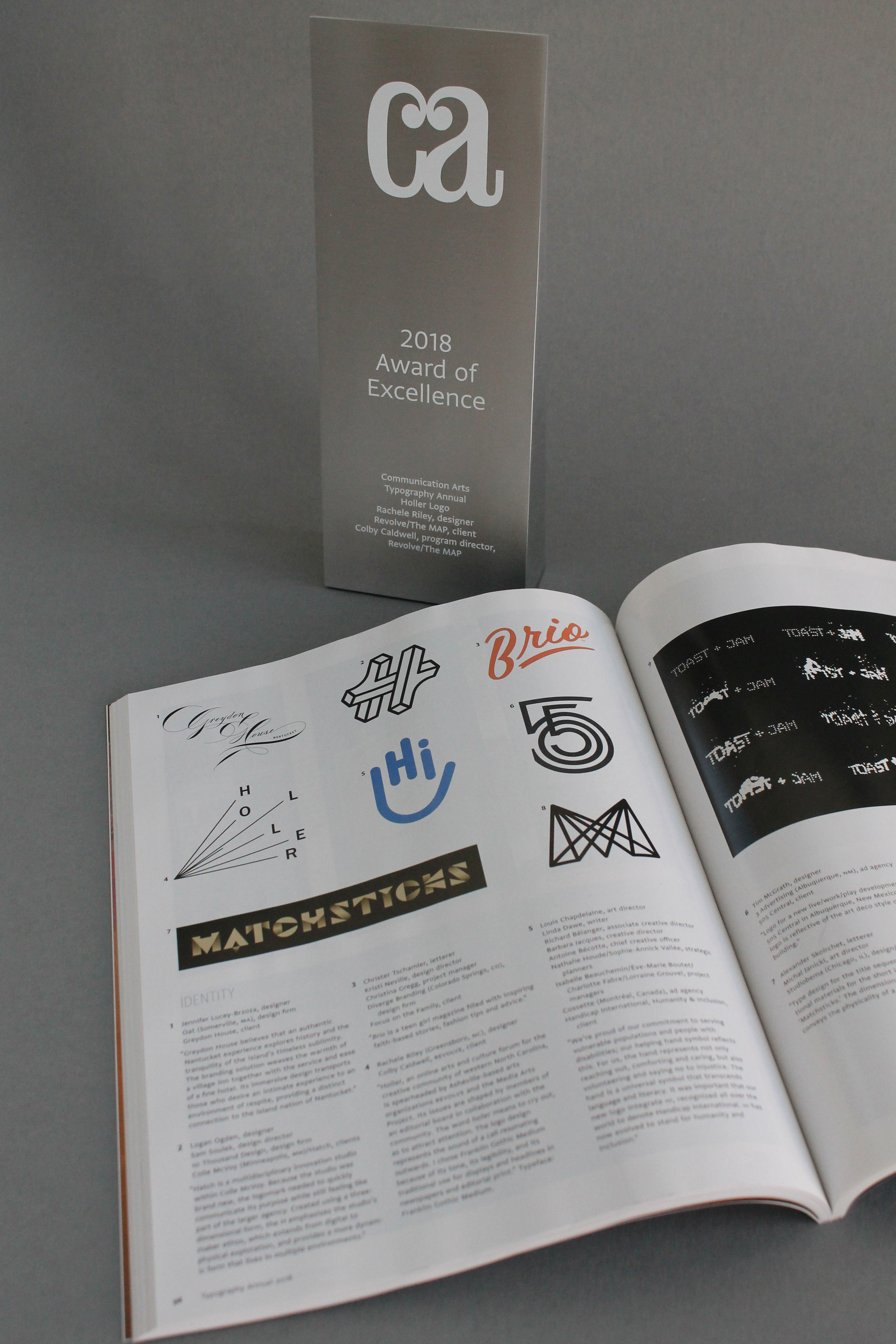
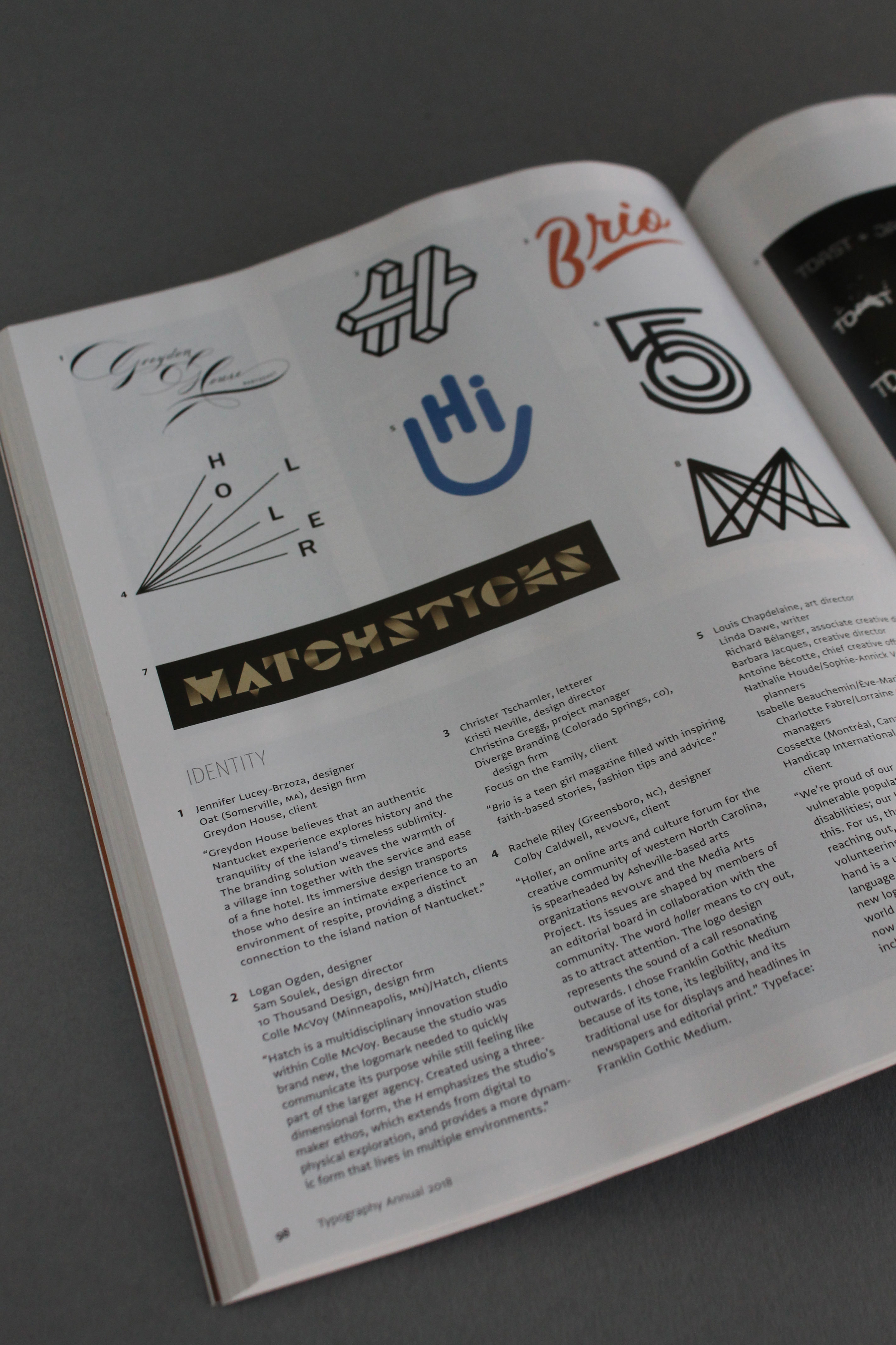
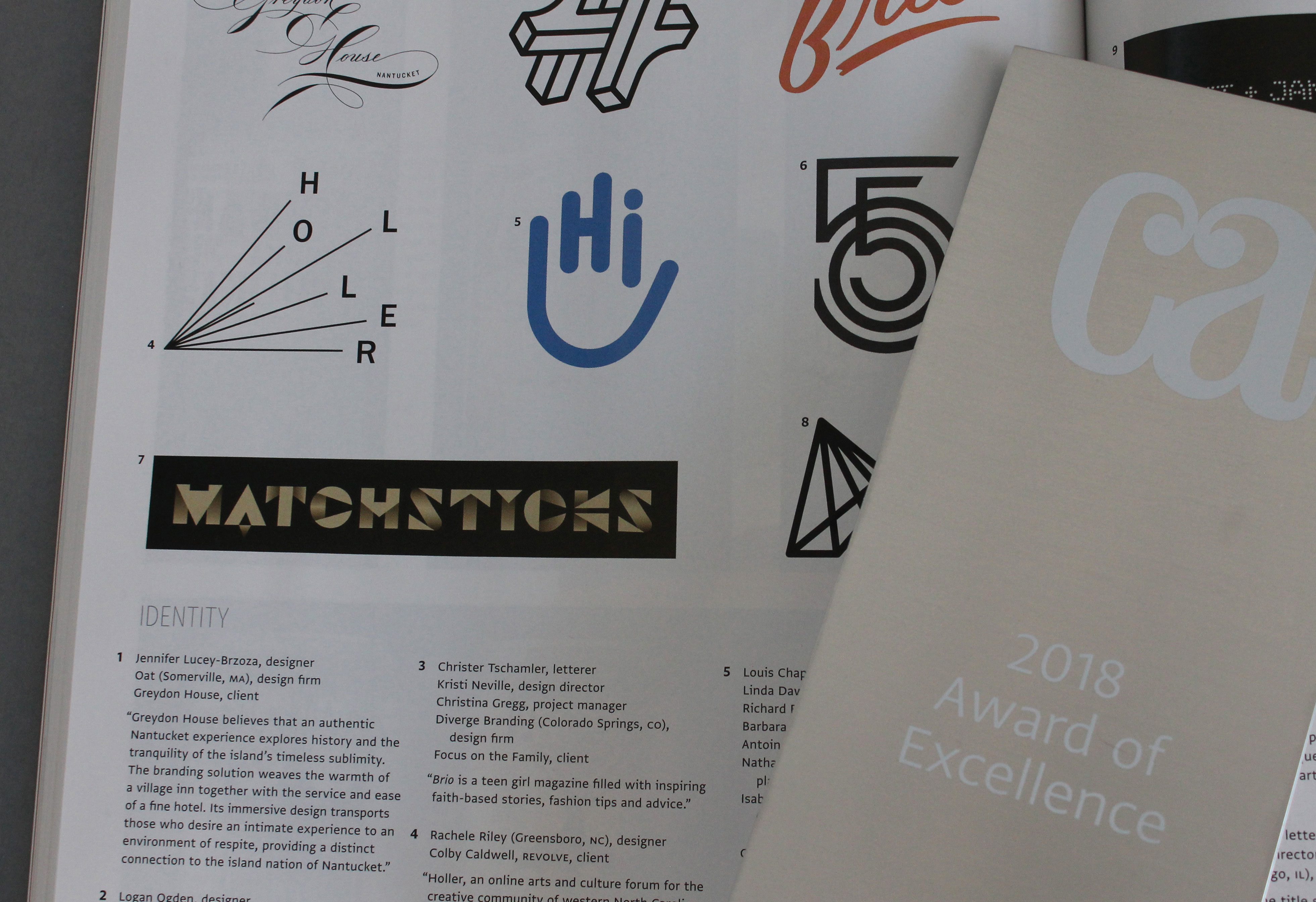
2017. Logo design for Holler (Revolve/MAP). Recognized with an Award of Excellence, Communication Arts Magazine, 2018 Typography Annual.
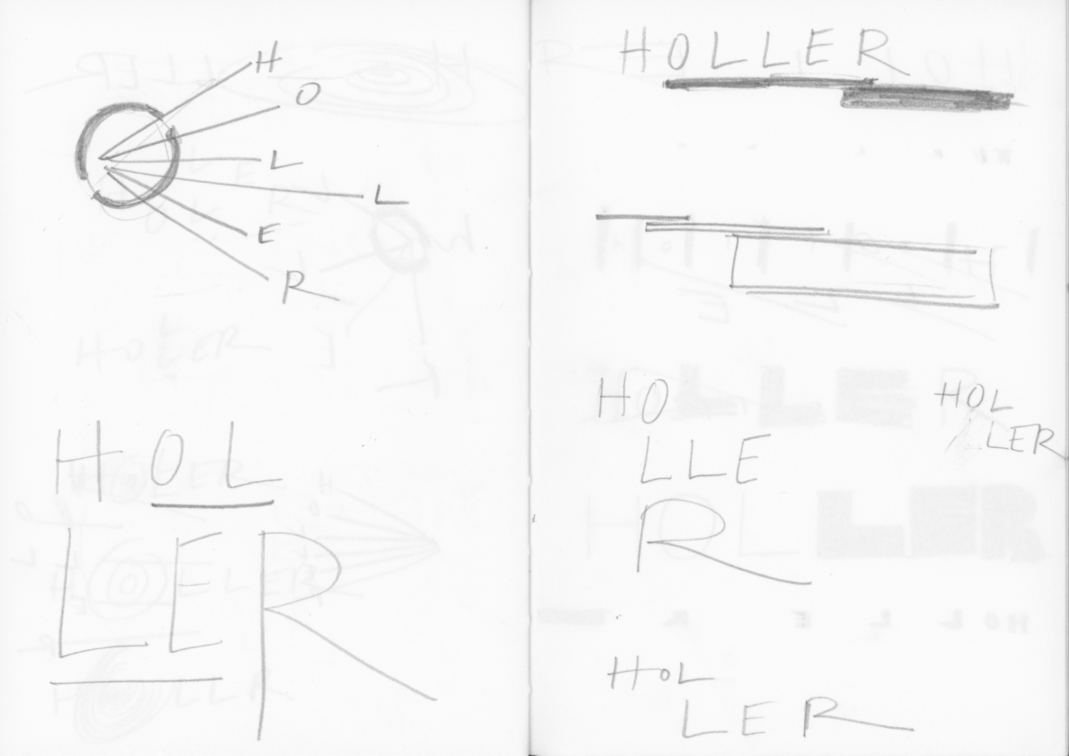
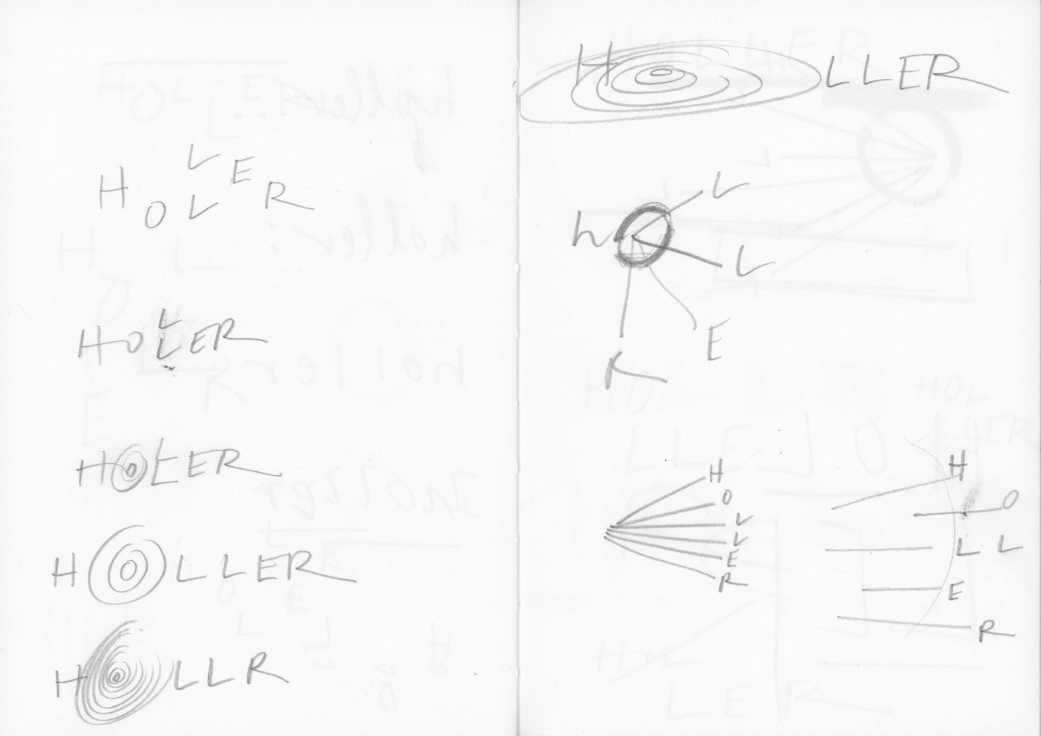
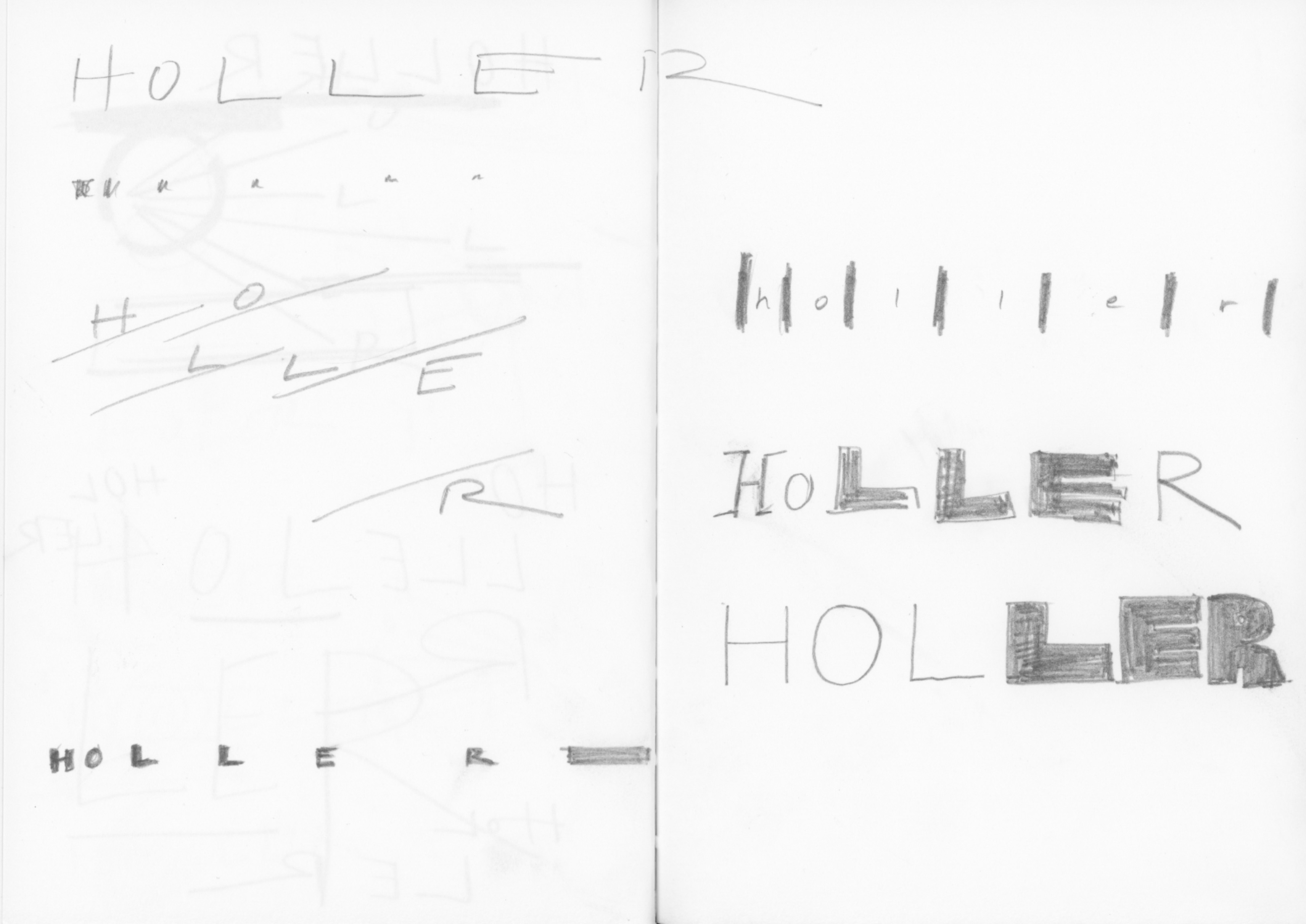
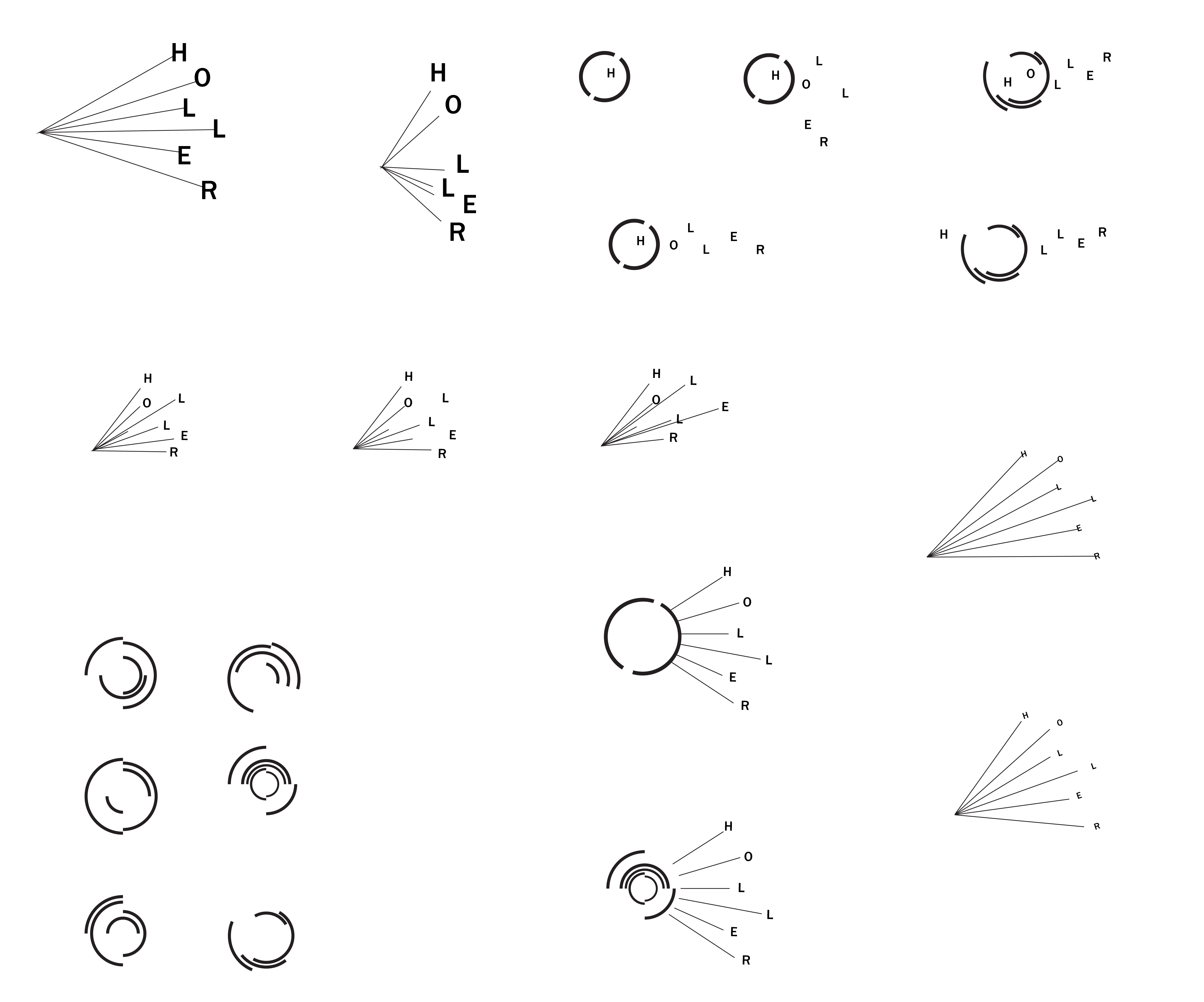
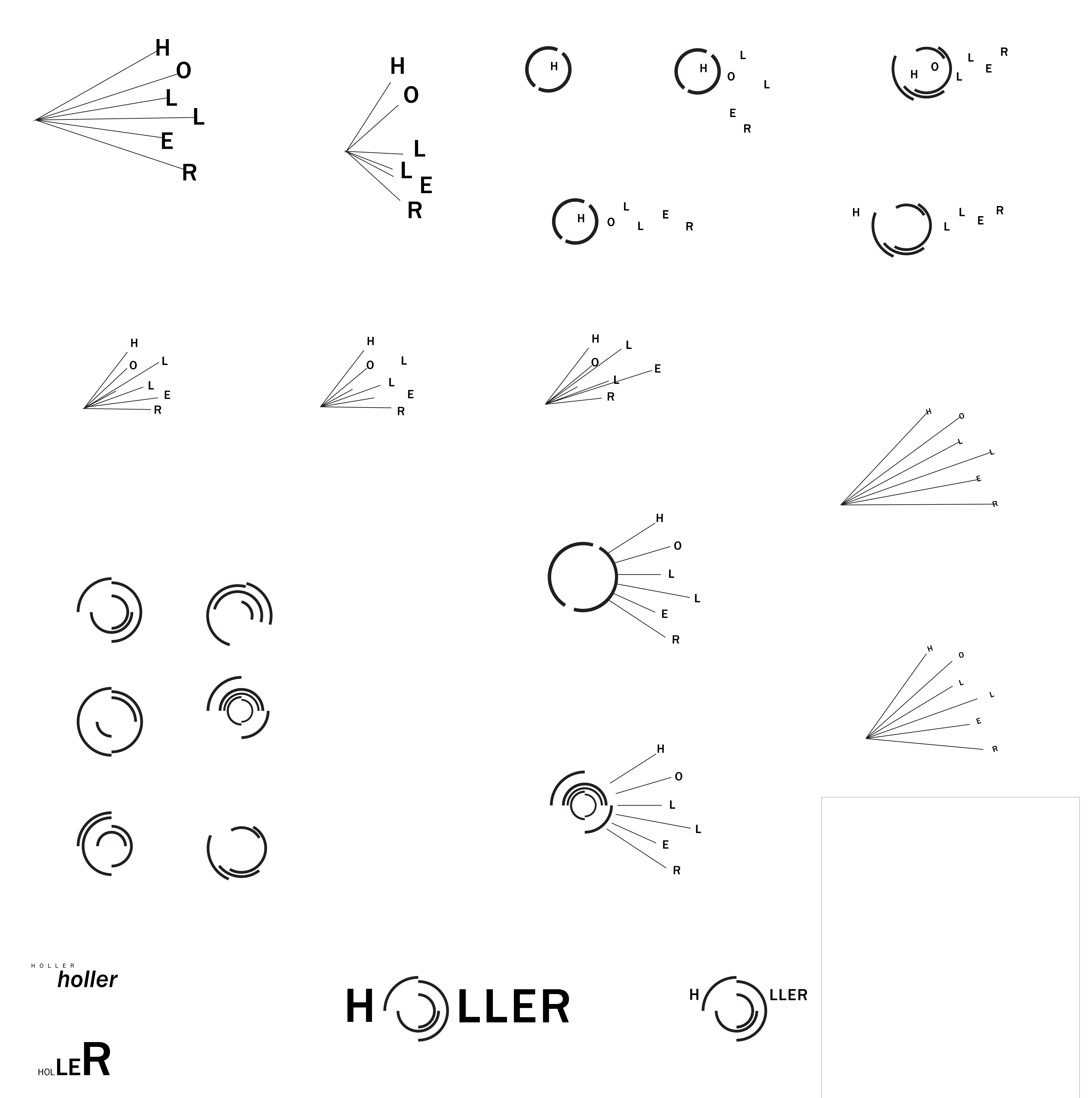
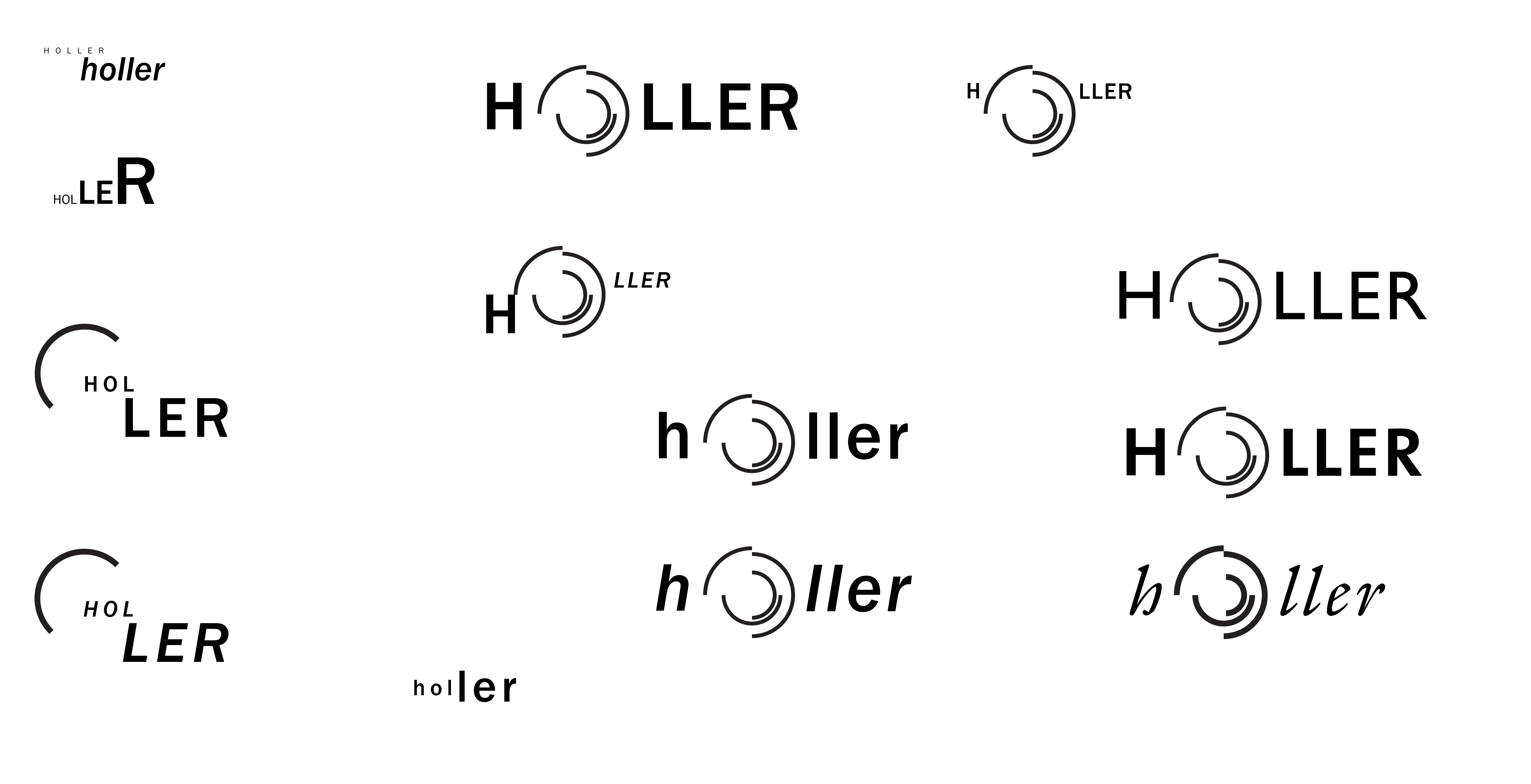
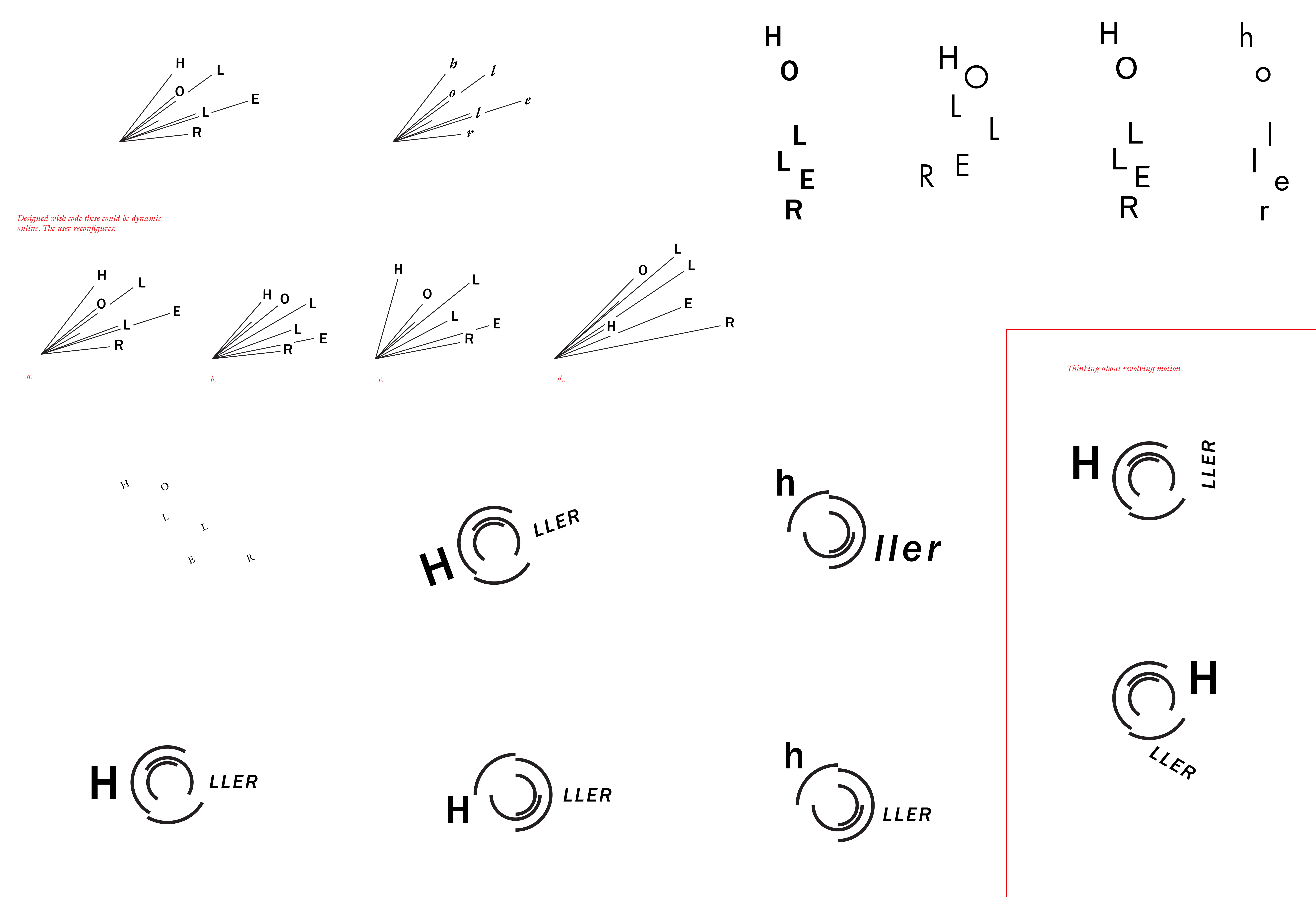
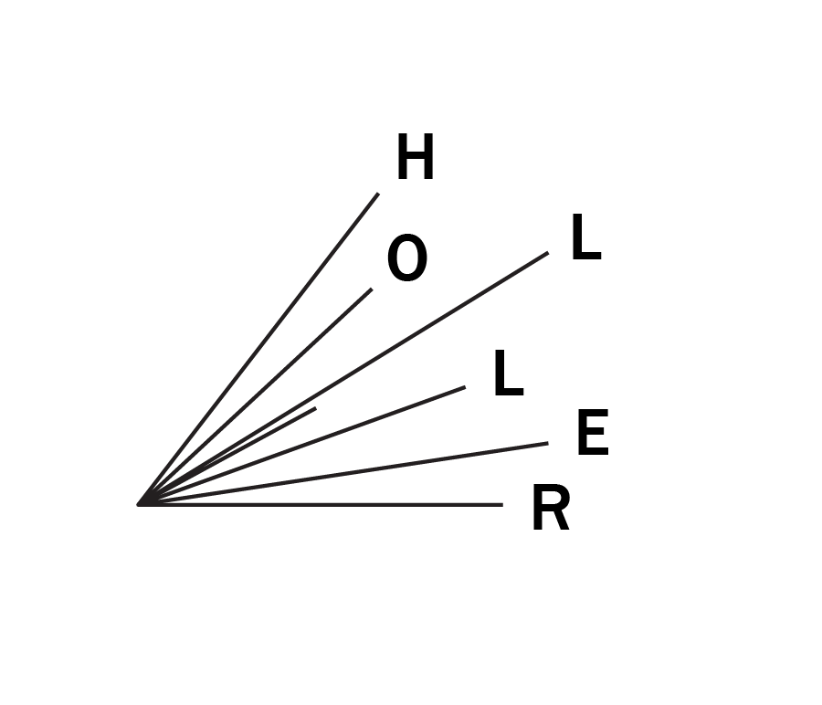
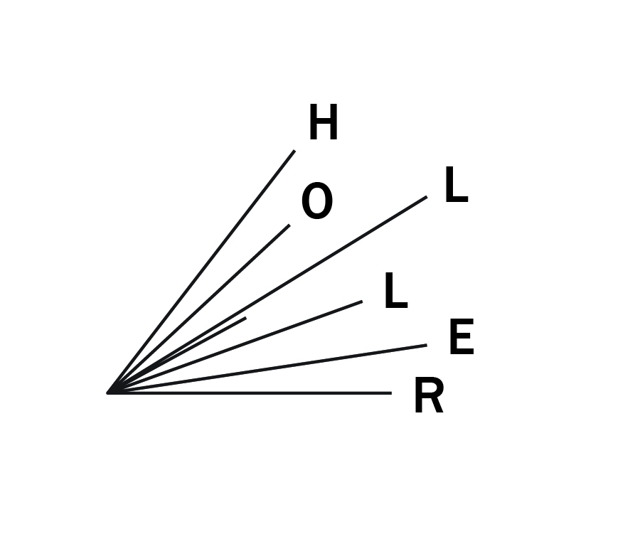
Designed for Holler, an online arts and culture forum serving the creative community of Western North Carolina. Spearheaded by Asheville-based arts organizations, Revolve and MAP (The Media Arts Project), issues are shaped by members of an editorial board in collaboration with the community. The word—holler—is ‘to cry out, as to attract attention.’ The logo design represents the sound of a call resonating outwards. I chose Franklin Gothic Medium for its tone and legibility, and in reference to its traditional use for display and headlines in newspapers and editorial print.
+ awards
Winner, 8th Annual Typography Competition
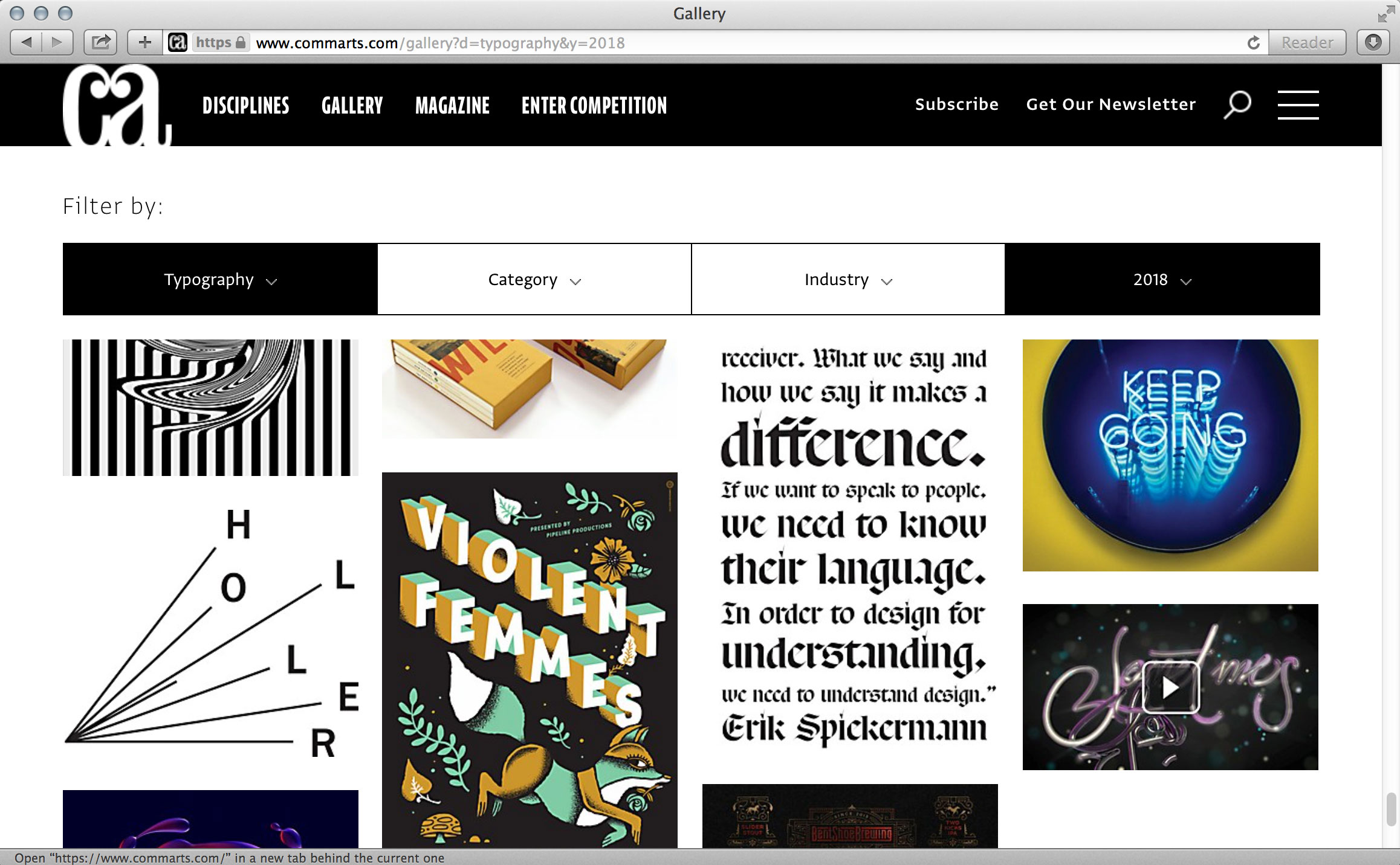
Communication Arts Magazine
Published in January/February 2018 issue
Online at www.commarts.com

[from CA press release]
“Communication Arts magazine, a professional journal for those involved in creativity in visual communications, has published the results of its 8th annual typography competition. 132 projects were selected by a jury of creative professionals; 1,753 entries were submitted to the competition.
“The selected projects are handsomely reproduced in Typography Annual 8, the January/February 2018 issue of Communication Arts, both in print and digital editions, and online at commarts.com. With the largest international circulation of any trade journal on visual communications, having work selected is considered a significant professional milestone to the creators and publishers of these award-winning projects.”
Judges:
- Chad Michael, principal, Chad Michael Studio, Dallas, TX
- Ksenya Samarskaya, principal, Samarskaya & Partners, Brooklyn, NY
- Michael Stinson, partner/creative director, Ramp Creative+Design, Los Angeles, CA
https://www.commarts.com/magazine/2018-typography
About the 8th Typography Competition and Annual:
“Published each January, the Typography Annual incorporates special reproduction techniques developed by CA, including quality 200-line color separation and printing on premium 70 lb. coated paper by one of the finest printers in the United States. Everything that was originally in color is reproduced in color at a size that allows the concept to be understood.”
Process—